BY MICHAEL GOODPASTER

(FOUR) CAROLINA PANTHERS
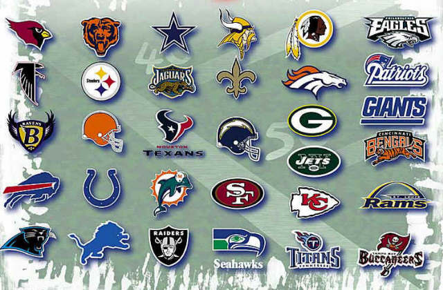
It’s just a panther with a turquoise outline, but it’s still pretty nifty. It stands out over the other logos because it just feels more contemporary. It’s colored in which a male, female, or kid could get excited to wear it. It’s simplistic, but well done.
(THREE) DENVER BRONCOS
It’s a bronco, but it looks cool. It has cool, yet imposing vibe to it. The dark blue lines of the bronco with flowing orange hair sounds a bit weird if you say it slowly, but then again most things do.
(TWO) TAMPA BAY BUCCANEERS
Like Carolina, this one looks way more contemporary than the others. The ripped up flag with the skull and swords on it is pretty cool. It’s bold and is more a symbol than a branding. Most of the other logos are basic line art, but there is some detail and some artistic swagger to it.
(ONE) RAIDERS/COWBOYS
I am not a fan of either team. Hell, I’m not a fan of any team that’s logo is listed today. I’m being objective. I accept that a simple letter C isn’t that awesome. I love what it represents, but visually it’s not on the level of other, cooler logos. Some would try to argue that it’s great because of it’s history, but if that’s the case then we need to go with Raiders and Cowboys first. These are the two teams that people are always wearing the jerseys of. The Raiders became cool in the 90’s when gangsta rappers kept pushing it. It’s a grey helmeted pirate with two swords sticking in his head. It’s just iconic in the same was the Yankees logo is… obviously on a smaller level. The same can be said for the Dallas Cowboy’s star logo. It’s just a simple star, but it’s become pretty damn universal. When a team’s logo becomes a representation for more than a sport, but rather a culture then it’s on to something awesome.

|


