|
|
|

|
|
[MUSIC] THE SAVAGE ANIMAL
"10 Random Band Sites V2" |
11.24.10 |
BY MIKEY MIGO

We've seen the rise and fall of so many different social networking sites. We've seen Friendster, live journal, MySpace, and others rise to various levels of popularity and then fade quickly as soon as the next fad took over. Basically, it's a rinse and repeat business. With this come a million band pages. For each MySpace and Facebook, there is a band pimping their product. They come and go with the flow. One thing that remains in style is the official band page. A band can go through tons of social networking, but an official site is the only reliable source of band information.
Last week, I took a look at the first batch of "10 Random Band Sites" and found some surprisingly good ones. This week, we take a look at another 10. I'll acknowledge off the bat that there is going to be artists that I'm not a fan of. I'm not directly looking to critique the band's music, but I will not hold back my jabs. I'm looking at the website. Is it innovative? Is it visually appealing? Does it function? Does it represent the artist well? Let's find out the answer those questions…
ARTIST: EMINEM
THE WEBSITE: eminem.com
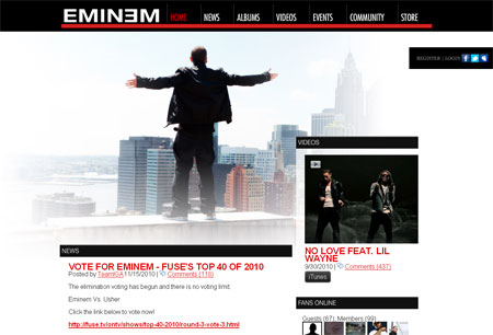
[Rating: 5.5] It's a perfectly functional website. There's not much pizzaz or flash to it. It has the featured video above everything else and then a side area for news and updates. There is no music player, but the video links on the front page pretty much cover the new singles he'd want to push anyway. It gets the job done but is a pretty boring layout. No matter what link you click on the page, you're looking at what you're going to get. I'm not a fan of Eminem, but he's respectable. The website,… eh.
ARTIST: SEVENDUST
THE WEBSITE: sevendust.com
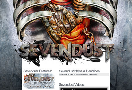
[Rating: 4.5] Wow. The imagery at the top of this site is awesome. I'm a big fan of the look and the work on the old school Sevendust font logo is great. Other than that, this site is one big trick. I remember Sevendust having a great site back in the day, but this page contains one of my biggest pet-peeves of band pages. A lot of time when dealing with not-so-famous bands, especially in the Chicago region, you'll find bands that cheat. They'll get a "dot com", but they'll have it link directly to their myspace or facebook page. That's cheap. Sevendust doen't go "full cheat", but they come close. If you want tour dates or news you have to click links that'll take you to their… *sigh*… myspace page. Want pictures? Yeah… that'll take you to flickr. I let it slide because Sevendust is always on tour. They're kings of the road and who has time to put together a good site these days? Not Sevendust.
ARTIST: PARAMORE
THE WEBSITE: paramore.net
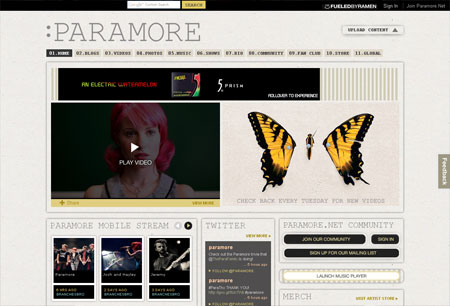
[Rating: 7.0] When I think of Paramore I don't think of great online experience. I think of music that's not my cup of tea that's getting more popular by the day. I was wrong about one of those. Their website is pretty damn good. It's a good no-BS site. There is content galore and it's very easy to navigate. But if for some reason you have trouble on the page, scroll to the bottom and there's a big index of what's what. It's pretty cool. I'm not into this band but it's good to know that if I became curious, it wouldn't be hard to become informed.
ARTIST: KATY PERRY
THE WEBSITE: katyperry.com
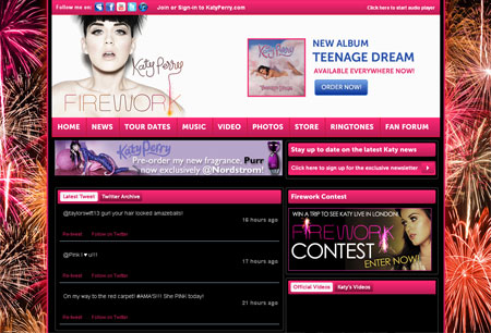
[Rating: 4.0] Whenever one sees Katy Perry the eyes automatically get pulled to her chestical area. It is what it is. She puts it out there for people to look at and being a red blooded man, you take notice of such a thing. She's talented and all too. She's like Pink, but less "thuggish" and more "he-he". So when you go to the page shouldn't you expect a little more… how you say… "goods". Of all the Katy Perry promotional material I've seen the stuff on her official page is the tamest. Kind of surprising, but whatever. There's a million sites online to cover that "issue", but it's still something worth noting. This site has content on it and all, but it's dull. Lots of pink and basic stuff. There is a template somewhere that gave us this site. For such a glitzy and showy artist it's a letdown for the site to be so lame.
ARTIST: MUSE
THE WEBSITE: muse.mu
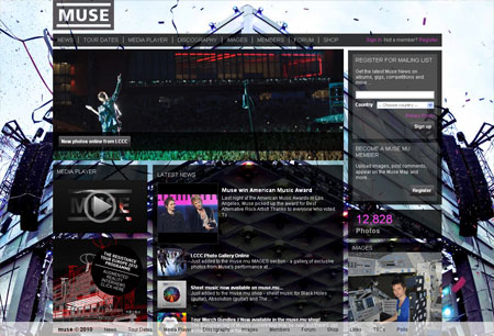
[Rating: 8.0] I am very impressed with the official site of MUSE. The lay out isn't reinventing the wheel, but it's done nicely. This many boxes with this much content would more times than not be a bit cluttery. Not the case here. There is no music player, which is about the only thing this page doesn't throw at you on its first page.
ARTIST: LINKIN PARK
THE WEBSITE: linkinpark.com
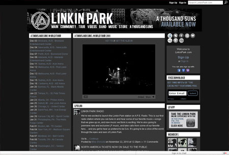
[Rating: 7.5] I'm one step closer to the edge and I'm about to… click. We start off with a splash page. On this page we get tour dates and banners for people to join their fan club thing. I appreciate the fact they're putting their ticket sales at the front of the priority list on the site. You can click the links and buy tickets from the get-go. Then we click "Enter Site". I may hate their music as of late, but I really like their website. It's cohesive, tight, and I love the color combinations. It looks so simple, but there is tons of content on this site which gives their fans a lot to do and look over.
ARTIST: WEEZER
THE WEBSITE: weezer.com
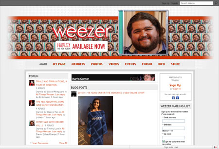
[Rating: 6.5] We start off with a splash page. On Weezer's front page we get links to buy the band's latest album "Hurley". We enter the site and it's more of the same. The first thing you notice is the dude's face smiling at you from the cover of the album. It's such a random, but perfect album cover that it's hard not to look at it and feel good. They did a great job with the site. Instead of talking about the site, I find myself talking about their new album and its cover. That's success on any level of websites. The site is functional and has the typical amount of content. There is the sign up to join their mailing list, forum updates, and on this day an attractive girl wearing a Weezer snuggie. What more do you need?
ARTIST: DISTURBED
THE WEBSITE: disturbed1.com
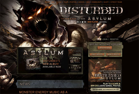
[Rating: 8.0] Awesome artwork here. It sort of reminds me of the animated Spawn series from years back. This is obviously an interesting site. The set up is unique, the music player is there for your convenience, and everything you'd need is there at your disposal. This is a site that I've visited in the past and from what I remember they've always had innovative and very good websites. It's hard to believe that this metal act is better as pushing visuals and image than most of the pop stars, who only have their image to begin with.
ARTIST: PEARL JAM
THE WEBSITE: pearljam.com
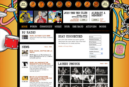
[Rating: 9.0] Of all the websites we're looking at today, this one is by far the most entertaining and colorful. It's just an easy website to look at and hang out on for awhile. They layout is simple, but sometimes it's okay when it's done well. It's done well on Pearl Jam's page. On top we get a sign up box for their mailing list. We see a link to their radio channel, news, and photos. The band has been around for a million years so there is a huge backlog of content. I'm very impressed by the fact they have set lists from as far back as 1990. All albums, all eras, and anything Pearl Jam is here and represented well. It's known that Pearl Jam is one of the most fan friendly bands out there and their website reflects that better than just about any other band site out there.
ARTIST: LIL WAYNE
THE WEBSITE: lilwayne-online.com
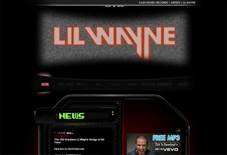
[Rating: 6.0] This site is cool. It's got a high tech vibe going on and the flash stuff on top only brings that more. I can't get into this site. It's cool in theory, but the execution feels really bland. I know how hard it is to get a good flash design set up and functional, but this page is boring. I wonder if it's more exciting when drunk on cough syrup. Anyone know?
|

|
| | |


